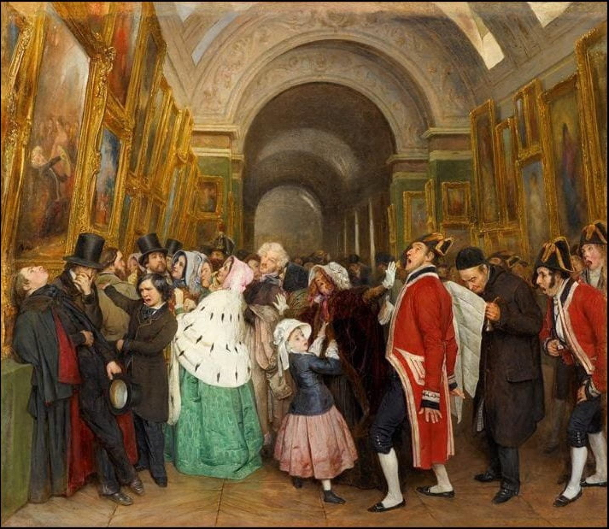
“So now we paint just to be judged?”: An Exhibition Review
The want, longing, and need for self-expression are prevalent in today’s youth. They don’t want to be known as the offspring of their parents, nor do they want to be known as someone else’s sibling. Self-expression and identity are intertwined with creativity, and creativity needs to be applied to a canvas. Young artists’ exhibits are becoming more prevalent, allowing us to see the colorful expression of their minds. I will focus on the Juried Exhibition in the Joann Cole Mitte building. There are a variety of works that have been crafted by many student artists here at Texas State University. Different mediums are used in the various pieces hanging up in the two divided galleries.
The arrangement of the Student Juried exhibition only adds to the variety of different art mediums and backstories of all of the works of art in this exhibition. This is because of how hollow, dim, and echoey the space where the collection is being held. Everything is spaced out, and to fully appreciate the vast amount of shapes and colors in these artworks, we must hear every step we take. When we walk in, it is natural to think that the categorization is alphabetical, but this is not true. Everything is randomized except for a few statues being in the same corner. However, this random arrangement does give me a sense of freedom because I can easily observe and walk straight to a work that catches my eye.
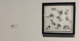
As you walk into the gallery, if you look to the left, you will see a massive graphite piece titled ‘Through My Eyes,” created by Julia Maldonda. This work of art is a slightly eerie yet whimsical work that makes you feel as if you are Alice in Wonderland. The title says “my eyes” but there are so many different eye shapes on the canvas it is unknown if the artist was referring to themself or used other subjects for this piece. Maldonda does not hesitate to smudge the “skin” around the eyes. All of the smudges represent their skin, and the graphite reminds me that this could have been erased easily, but the decision of Maldonda overpowers the urge to erase the creases. The anatomy of the eyes is equal to how eyes in the real world work, but it is worth noting that they are enormous and are at different angles on the canvas. The more I look at this work, it gives off an out-of-this-world sensation because the finger pulling on the folds under the irises pops out of a random circle, and there is no connection to the body.
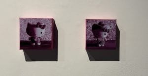
The two works of art that drew my eyes next were ‘My Obsession’ and ‘The Yee to My Haw’ by Drew McDonald. The material used to create these works is oil paint, yet it almost feels like they used crayons to paint this because you can see the blend of white and pink on the subject’s face. What is the subject, you might be wondering? McDonald’s uses a regular ‘Hello Kitty’ in the first half of the duo set and a ‘Hello Kitty’ wearing a cowboy hat in the second half. This naturally made me smile as someone who loves all things Sanrio, pink, and cutesy. The background is the print of a Texan bandana that is commonly worn by cowboys. It is easy to judge how easy-going and unserious this work is, as this could be hanging in a children’s room. Others who focus on absolute evaluation might question the decision to display this piece; however, the subject within this work has always been a fun, light-hearted figure, so these two artworks represent these emotions well.
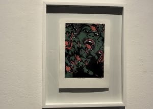
Daniela Sepúlveda’s ‘Wicked Bitch’ is a screen print artwork that reminds me of a poster that would be brought from a music festival or at your typical young adult art festival. It is easy to stare and get lost in the deep-seated eyes of the central face of the poster. It’s almost as if she is trying to cast a “wicked” spell on you. I think using forest green for the subject’s skin colors and pastel orange for the tongue and sharp nails was an attentive decision of Sepúlveda. The harsh sketch lines give the fingers an extreme look and make the teeth look damaged beyond repair. I am reminded of the Wicked Witch of the West and all of her grotesque facial expressions and screechy voice. Sepúlveda’s decision to name this work of art ‘Wicked Bitch’ is almost too good that it’s just too simple. If I looked at the print first before looking at the title, I would think, “What a bitch!” because she does, in fact, have an extreme “resting bitch face.” This work of art could most definitely be an official poster for the next ‘Wicked: The Musical” world tour.
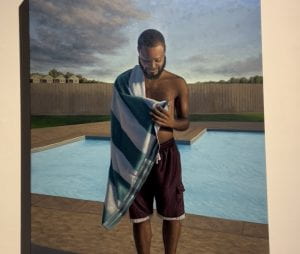
Morgan Grigsby’s ‘Cool Summer Breeze’ is placed right next to ‘Wicked Bitch’, yet the two of these works are opposites. Grigsby uses oil paints as their medium for this massive painting. It is apparent that Grigsby takes account of all of the details in this work of art as we can see the horizontal array of houses in the backgrounds, and this lets us know this is a quiet neighborhood with not a lot going on, but that’s just life. There are two things that I find impressive about this towering artwork. The first one is the careful detailing of the reflective waterlines in the pool because it’s almost as if I could bend over and see a skewered version of my face on the pool’s surface. Grigsby spent significant time ensuring the pool was this work of art’s second most crucial subject. The second element that stood out to me is the central subject of this painting, the Black man wrapped in a towel after his swim in the pool. It is unknown if this man is related to Grigsby in any way, but simply telling from the facial expression, I would assume they have a close relationship. I am a massive sucker for emotional “simple but happy” life paintings, and ‘Cool Summer Breeze’ is precisely that. The man’s face gives off a wistful yet amicable expression, and we can see that he is enjoying this time in his life and the time that he is spending with Grigsby, presumably. The eyes are smiling slightly more than the mouth itself, and it genuinely makes you want to tear up a bit because of how at peace this man is. I mean, he is placing his hand over his heart. The lights of an afternoon sunset lighten up the face of this unknown stranger to us but a friendly relationship with Grigsby. Grigsby may be a young college student, but this oil painting showcases that they have had many life experiences and can bring a moment of life and apply it to a canvas. This a reminder to take it one day at a time and enjoy the small happiness that life brings you.
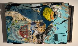
I realize that the most explosive works of art are always multimedia or mixed media works. This is the case with Michelle Delgado’s artwork, ‘Make Amends.’ I am still deciding if I should tilt my head to a 90-degree angle because they hung this enormous canvas incorrectly or observe this piece at its horizontal setting. “It is so easy to get lost in this painting,” said every art critic, but it is not difficult to get trapped in this array of blue and bluer. I am not ignoring the random spot of red lines, but all I can say is, “OH, that’s random…” and that’s about it. Color is apparent in this work of art, but Delgado is so great at applying these colors in shapes, streaks, lines, and blobs that we have never seen before. Delgado makes ‘Make Amends’ an artwork somewhat of an illusion. It goes entirely against the favorably looked upon “flatness of a canvas” We can see where the 2D surface becomes 3D and interacts with our reality. The curvatures of the paint on the top left or bottom right, if you look at a 90-degree angle, are sticking out just a little too much. Or the random cube on the bottom right, like it is daring me to touch it. There are simply too many things to discuss in ‘Make Amends,’ but to wrap it up, the eyeball-looking thing wraps all of this up. It is quite the monstrous eye, with a slimy green cornea and the inner parts orange with yellow spikes. I have no idea what Delgado was going for in this work of art, but ‘genius’ is the only word coming to mind right now. I will be coming back to take an even closer look to see if Delgado secretly added a new detail to this artwork without anyone knowing.
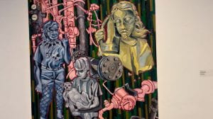
The final work of art from this exhibition that I will detail is Victor De Luna’s artwork ‘Contradictions”. There have been many times that I visited the Student Juried exhibition, and this oil painting has always, and I mean always, caught my attention. The size of it is fairly normal compared to the more massive works, but what draws my eyes are the shapes of the characters in this gorgeous piece and their randomized personalities. ‘Contradictions’ is no doubt an artwork that is exploding with colors, but I absolutely love the intense shadings of blues, pinks, and yellows. I also love how bulky the rectangles are in the subjects and in this artwork in general. It reminds me of the steampunk aesthetic because the three subjects look more robotic than human, and the pipes/gauges that extend beyond the canvas make it seem like I am in a factory that has been taken over by these weird, humanoid robots. De Luna honestly does know the definition of contradiction and applies this word to a flat surface. There is simply too much going on, for example, the grey robot/human/tin-man. Why is it holding the dog as if it’s a newborn infant? The blue subject looks more human out of the three of them, but why is it blue? It’s definitely a rock n’ roll lover, so does that mean it’s blue because it’s emo? And can someone please tell me what the yellow subject is holding next to their ear? All I know is that it’s not a cellphone because it looks more like a heating iron. Everything from the colors clashing with each other to the different actions of the peculiar robots to the pipes that don’t seem to be connected to anything is everything ‘Contradictions’ is about. From a distance, De Luna’s ‘Contradictions’ makes us feel confused. We approach the canvas to get a closer look for some clarity, only to feel more conflicted as we come to the canvas.
After going through all of these artists’ works of art and deciphering the meanings behind all of them, it is now time to conquer the overall question. Why does this exhibition matter? This is important because art is art, and whatever is created by someone should be recognized as that person’s work and who they are. All of the artists and their artworks are distinctive and differ from one another. I find the Student Juried Exhibition appealing because there is no overarching theme, and all the works of art are gathered here because they were created and exhibited by college students. This matters because College is a place where the utmost transformation of a teenager to an adult occurs and enables us to learn more about ourselves intrapersonally. A student’s self-expression can be showcased and detected collectively in this exhibition. Independently each artwork is exploding with identity, memories, and expression. When you step back and see these canvases from a broader perspective, you can see how much transformation each student artist has gone through and how beautifully these feelings of revolution have manifested in each canvas. This collection of artworks gives off a sense of collectiveness, and they all work together well because they’re all done by Texas State students on the same artistic path with the same aspiration to pursue creative careers. This fills me with pride, making me want to shout, “These are my friends, and look how extraordinary they are to make something like this with their hands! They have done well.”